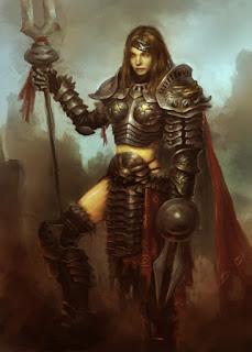
How to paint character in steel armor. Paladin female warrior in steel armor with bunny design. It is finally done! It takes me about 6-8 hours to actually paint total. Continuing from previous post, the idea derives from the year of the rabbit. It has been quite a while since I did a heavy knight set type of armor. I used to do it everyday at ArenaNet. :-) So I guess I miss making heavy armor design a bit. So partially I think I did it to satisfy my character with armor design craving.
In this design, I first just focus on the shape of the overall body (silhouette). Once I figured out the silhouette I am looking for, I will start to paint and render them out. It is a lot easier to get the big picture down first, then paint in little tiny detail afterward. You can have in mind what kind of detail and design you are aiming for, but just keep it at bay until you can settle with your overall look of the armor as a whole.
Most of the time when I work on the armor designs, silhouettes is probably the most important element to begin with. I will sketch tons of thumbnails of different silhouettes, then pick and choose. Because if you can variety of cool looking silhouettes, then for sure they will all look different when you get down to really draw and paint them. Anyway, that is just some tips. It will save you a lot of time in character design process. Also get you variety of different design in a quick way.
Ok, here is off the topic but my friend Carlos is fundraising for The Leukemia & Lymphoma Society. I just donated $25 today, they have list of donors on the right column of the page. So if you guys are interested in good cost and good karma, feel free to help us out. Here is the link Carlos' Fundraising Page ;-)
Here are step by step Female Paladin in Steel Armor.
Continue from previous post, New armor 211 year of the Rabbit

Final design

Enjoy the post,
CHECK OUT our full length PREMIUM video tutorials


In this design, I first just focus on the shape of the overall body (silhouette). Once I figured out the silhouette I am looking for, I will start to paint and render them out. It is a lot easier to get the big picture down first, then paint in little tiny detail afterward. You can have in mind what kind of detail and design you are aiming for, but just keep it at bay until you can settle with your overall look of the armor as a whole.
Most of the time when I work on the armor designs, silhouettes is probably the most important element to begin with. I will sketch tons of thumbnails of different silhouettes, then pick and choose. Because if you can variety of cool looking silhouettes, then for sure they will all look different when you get down to really draw and paint them. Anyway, that is just some tips. It will save you a lot of time in character design process. Also get you variety of different design in a quick way.
Ok, here is off the topic but my friend Carlos is fundraising for The Leukemia & Lymphoma Society. I just donated $25 today, they have list of donors on the right column of the page. So if you guys are interested in good cost and good karma, feel free to help us out. Here is the link Carlos' Fundraising Page ;-)
And here is the final design of the Paladin.
Here are step by step Female Paladin in Steel Armor.
Continue from previous post, New armor 211 year of the Rabbit
Final design
Enjoy the post,
CHECK OUT our full length PREMIUM video tutorials


Comments
Good job <3
This inspired me to do this painting: http://rsa-legend-9.deviantart.com/art/Guardian-of-the-Spear-197282168
Thanks so much for your tutorials, they make me a MUCH better artist. :)
hope all is well brother.
Btw, i'm trying to improve on my landscape paintings too, since you said me that i should use less colors and try to value/depth control more.
so i'm doing this painting with that in mind:
http://img829.imageshack.us/i/stage04.jpg/
if you can give me a feedback before i move onto harder steps i would be so grateful. :)
all the best,
Cheers!
- Danilo
Rice> Thanks. I love drawing girls or meaning pretty women. I've been drawing and painting a lot of them and I guess it pays off. ;-)
RCA> Nice! Keep it up. I sure hope my tutorials do help you guys get better. Otherwise, I should quit doing them. Luca knows, he's been around here since we started back in 2007 and he has come a long way ;-)
Luca> Thanks brother! Good to see myself finish something too. Been busy moving files from Payloadz cuz people can't access or get the files more often than not. Now e-junkie should work better! A lot of hours of boring work.
Danilo Ferreira> I usually don't critique because I don't know what to say. But IMO, make it clearer and strong contrast on the foreground, in the far back soften the edges and keep the value range close together (in small range).
peace!
Post a Comment