support my work on patreon live workshop and online courses with Xia Taptara FREE VIDEO AND PS BRUSHES

Character Concept Art process painting tutorial update

How to paint executioner.  Character Concept Art process painting tutorial update. Here is an update of the Executioner concept illustration.
You can see the previous post, Digital Art technique assign color to gray-scale painting. Have another roughly 40-50 minute to work on the guy so here it is.
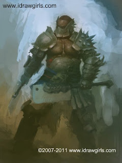
Executioner Concept
Here are short step by step.

concept art tutorial, digital painting

And a Closed Up shot, look very messy. But you get the idea :)
concept art tutorial, digital painting

To be continued next post :)

Comments

Luca said…
Good work Xia, it's really getting better. The chest muscles are well defined and the overall atmosphere is really cool. Keep it up!
Chris Reeve said…
Those fins on his mask are a nice touch. Hey, you seem to have posted more of other peoples vids recently, so I thought you (or anyone really!) might like to take a look at this one. I like the use of the warp tool:

http://www.youtube.com/user/daarken#play/user/0A8590A6809E217F/0/I8tn6oMcr3Q

p.s. you know when that art book of your team is available to buy?
Chris B said…
Nice! The helmet look really good now and the extra details on the clever sword look nice good job.
Sebastian said…
Very nice! A cool character really starting to appear. Keep it up, man!
snow said…
hey xia i have a question,

i've noticed my digital paintings have been really kinda, air brushy and muddy lately. all the value is there, it just doesn't look right. ive been using a 100% opacity brush with opacity jitter on pen pressure. any tips, or custom brushes you recommend, i've been trying to figure out which ones you use but kinda failing. any tips would be so appreciated.

thanks as always :)
Chris Reeve said…
Sorry to cut in snow, but I think I can help you with this. The problem sounds like you pick your colours, and as you go along you aren't getting the full opacity hence the mudiness. Make sure that if you want the actual colour you pick to press hard, and if you want a nice hard edge like on metal, press hard, otherwise you may end up with a desaturated and ghostly image. You may find that the pressure sensitivity on your tablet isn't sensitive enough too - do you really have to push to get 100% opacity? Make sure to fiddle with your tablet preferences. Finally, the easiest way of remedying this is to simply use a brush without opacity jitter aswell. That way the colours stay bright and you can use the opacity jitter brush for blending and things.
snow said…
I appreciate your input Chris. I do somewhat pick colours as I go. I also find I don't have at all the level of control of my pressure sensitivity on my cheap bamboo tablet as I want and I think it may be a little all over the place (do you think a better tablet would help?). I think I lack confidence to use a solid 100% colour, and opacity jitter allows me to gently layer it on. BUT this does make my paintings look very amateurish and honestly - like they are made of a silicon material. However, I think I will try replicate some of Xia's tutorials I have where he uses 30-70% opacity, and drop the opacity jitter for now. It's odd because I can render fine in pencil, photoshop is just a medium i love but am struggling to get used too and find my style.
Chris Reeve said…
Well I can't say for sure that a more expensive tablet would help with that, but it's highly likely that it would have a greater range of sensitivity. However something that jumps out of me from your post: "I think I lack confidence to use..." - when you feel like this, you have to dive right in and be bold, and learn from mistakes as you go, otherwise how can any of us improve? So I would try to use nothing but 100% opacity and see what I could come up with.
manit said…
good work xia!keep it up.i am also thinking to start digital work.i am planning to buy waccom soon.i have never done anything in photoshop.well what do you think after seeing my paper work(also please tell me something about my paper work),how will i do in photoshop any guess.please do tell me.have a great day.bye.(other suggestions are also appreciated)
snow said…
Thanks again Chris. I'm going to experiment with 100% and explore. As you say, it will mean as a I lay down the selected colour, it may be right, may be wrong, and from that I could learn whats right, instead of continual not sureness - at least for the start to develop some confidence. I'm thinking of raising the sensitivity on my wacom too, I noticed i have to push quite hard for the darkest darks, which may explain why things are so muddy, as colours i choose are being laid down very opaque.
Chris Reeve said…
Yea that's my point about the tablet. Just remember you don't have to show anyone your work anyway so feel free to make as many mistakes as you like! :) Enjoy.
Gerardo said…
Very cool! I like the detail you put into it;
http://shtarticles.blogspot.com/