


Digital Painting tutorial court lady video and step by step.
I know it's been almost a week since I update any drawing or painting...been busy with the Manga comics. And of course work at ArenaNet :)
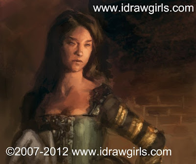
Now, this tutorial turns out nicely. One of my better ones. It doesn't take long and turn out the way I want. Surprisingly that doesn't really happen a lot because we all want to push it even further as an artist. The more we paint and draw the more experience, we tend to see more mistake and how it should have been better. Anyway, here is a painting of a court lady...part of a small project I am working on.
So if you like this video here are some of the video that have similar content just a bit different in presentation digital painting tutorial sleeping beauty. Another is Digital painting female character red and the recent pieces Drawing Tutorial Zombie ninja character
But if you are looking for more specific study of anatomy then watch Drawing body muscle torso anatomy tutorial. And Drawing arm muscles bicep tricep There will also be some basic tutorial links include there.
Also as I mention values (shades, light) comes before colors. These are the more fundamental video that you should watch Learn digital drawing and painting (this one focus on face of a female profile and emphasis on values establishment.) How to draw woman top view from the slightly top angle, not extreme just a little tilt. How to draw Manga girl character (don't be deceive by the name, this one show how to establish values really well.) And at last Sketch character design Villain (A male character demo focus on facial design)
Artist Quote: "It's on the strength of observation and reflection that one finds a way. So we must dig and delve unceasingly." Claude Monet
Here are the step by step Digital Painting tutorial

Here is a video tutorial: Digital Painting Court lady
Drawing Software & Tools I used and recommended:
-Wacom Intuos3 6X8 Pen Tablet or Genius MousePen 6x8
Softwares:
-Gimp or Adobe Photoshop CS4 (Professional software)
Hope you enjoy all the tutorial. Thanks for visiting and subscribe to idrawgirls.com
PEACE!
I know it's been almost a week since I update any drawing or painting...been busy with the Manga comics. And of course work at ArenaNet :)
Now, this tutorial turns out nicely. One of my better ones. It doesn't take long and turn out the way I want. Surprisingly that doesn't really happen a lot because we all want to push it even further as an artist. The more we paint and draw the more experience, we tend to see more mistake and how it should have been better. Anyway, here is a painting of a court lady...part of a small project I am working on.
So if you like this video here are some of the video that have similar content just a bit different in presentation digital painting tutorial sleeping beauty. Another is Digital painting female character red and the recent pieces Drawing Tutorial Zombie ninja character
But if you are looking for more specific study of anatomy then watch Drawing body muscle torso anatomy tutorial. And Drawing arm muscles bicep tricep There will also be some basic tutorial links include there.
Also as I mention values (shades, light) comes before colors. These are the more fundamental video that you should watch Learn digital drawing and painting (this one focus on face of a female profile and emphasis on values establishment.) How to draw woman top view from the slightly top angle, not extreme just a little tilt. How to draw Manga girl character (don't be deceive by the name, this one show how to establish values really well.) And at last Sketch character design Villain (A male character demo focus on facial design)
Artist Quote: "It's on the strength of observation and reflection that one finds a way. So we must dig and delve unceasingly." Claude Monet
Here is a final digital painting Court Lady
Here are the step by step Digital Painting tutorial
Here is a video tutorial: Digital Painting Court lady
Drawing Software & Tools I used and recommended:
-Wacom Intuos3 6X8 Pen Tablet or Genius MousePen 6x8
Softwares:
-Gimp or Adobe Photoshop CS4 (Professional software)
Hope you enjoy all the tutorial. Thanks for visiting and subscribe to idrawgirls.com
PEACE!
Comments
I don't know if this will be useful to anyone, but I've been out taking pictures of the rocks and cliffs around here. Some might be useful for reference so I posted them up:
http://s257.photobucket.com/albums/hh235/chijts/rocks/
I put my flip flop in one to show the scale, but it's quite small/sands too bright. If you find it though, have a cupcake!
Enjoy! and have a good weekend :)
Chris > Thanks :D Those rocks rocks.
By the way, that quote is really helpful. Singer Sargent was a friend of Claude Monet... great old legends!
http://c-trainsentertainmentreviews.blogspot.com/
http://conceptart.org/forums/showthread.php?t=17837
http://itchstudios.com/psg/art_tut.htm#skin_tones
And here's an explanation by Jason Manly which is pretty good:
"here are a few formulae ideas that can help when painting flesh
in order to paint great flesh one must understand light and how light works.
1 what temperature, color and saturation is the light? if one decides on the light temp, saturation, and value than one can surmise the answer to that same thing in the shadows.
a. shadows can often be the opposite temperature/intensity/value as that of the light. they can also shift toward the compliment color of the light in terms of dominant color feel. radiosity from another reflective surface can easily change this by bouncing color into the shadows and shifting it toward the color which it is reflecting..
b light has a range of temperature from warmest to neutral to coolest. a cloudy day would be a neutral light...neither the light or shadow would be warm or cool...it would be more balanced....however a sunset would be a warm light and thus the shadows are more cool visually.
you can sometimes think of it like a visual teeter totter...the more down you go..the more the other one goes up. a sunset is very warm right...well the shadows are very cool...and both are very saturated in color often times. a neutral balanced light has less warm...and less cool...but neither is up or down...it can equal out.
2light affects local color and light sits on top of the forms and flesh. there are places in the flesh that are thicker and where the light shines through to a higher degree (the cheeks and ears and nose for example). there are places where the flesh is on top of bone and thus is often more reflective in terms of the light source and reflect light source. this is especially obvious on caucasions...a red nose and ears...a lighter less saturated forhead (barring sun burn).
justin sweet pointed out that he noticed that the darker the complexion...the more specular highlights he noticed.
now here is an easy way to think about it. if you have a person with an olive complexion....that is the local color...now the light source will shift the large shapes of light toward that of the light color/saturation/temp/ and strength....ie the close one moves toward a bright warm light the warmer and lighter ones skin would become. step into the light my friend!
b. now here is a key...in any given shape of similar value there is a SPECTRUM OF COLOR. this color shifts as it turns away from the lightsource and also can shift due to thickness of skin or other outside situations like a reflection or radiosity coming from ones shirt. THIS spectrum of color happening in a given shape of value could be called SAME VALUE COLOR VARIATION. even the lightest highlights will often have two or three or four colors in them if you really look...its not just a little yellow dot of light...there is usually a range of color in there. putting down this same value color variation will help suggest the feel of light.
...
4 often times..either the light or shadow will dominate in color..temp..saturation...etc....
the reason for this is because ones eyes tend to either look into the light or the dark right? your eyes adjust....the more you look in the dark the more color and shadows you see...but when you do that the more your eyes adjust and the less you see in the light. sit in your room with all the lights on...turn out the lights and you cant see shit...it has to do with the way the eye sees. now there are always reasons that this little theory can change (radiostity again or some others) but for the most part that is how all of us see. one can not dilate one pupil and have the other one small at the same time.
5 knowing some of these things will allow you to place your light on your local color and shift the shadow colors toward an appriate color range as well.
the stronger the light...either in value...temp...or saturation...the more the skin will shift in color. stand under a neon light...that changes everything right....well not everything...there is still same value color variation..there is still opposite value/color/temp/saturation happening there.
all you ahve to do is look for it.
the key to understanding color is drawing and painting from life. davi i cant stress that enough. you have to look and paint to truly understand what you are seeing.
Im no expert...but these are some things i think of while i work.
jason
PS...go to www.sijun.com and read the "color theory" thread if you have questions about this stuff...there is a lot of info we all shared a couple years back that will help.
check out this link to the leon bonnat painting...the hands....notice how the shadow color has the strength in terms of saturation...the light is less saturated...the light is also cool (ALTHOUGH ITS NOT ONLY COOL>>>IT HAS A RANGE OF TEMPERATURE...though the overall feel of it is cool compared to the overall shadow colors)
you can find these theories put to use in the works of the masters. the answers are there...but also right in front of you. what colors do you see...what colors are coming from the light? what colors are coming from reflective sources?
the best way to learn this again...is to paint from life...since that is difficult if you cannot..then simply LOOK LOOK LOOK.
http://209.126.148.88/forums/attachm...tachmentid=195 "
Xia, this court lady has a really realistic skin tone... so nice!
Thanks again.
GREAT LINKS for the ROCK, money!
Pokepetter> Thanks brother! also for the resources! Yeah! I love Prom (Niklas Jansson) tutorial and analysis. Honestly he is one of my earliest inspiration on digital art. He paints so well and it across between realism and stylistic. REally dig his work still. *I really want to post the lighting tips on the main blog, but I am afraid that Manley will come after me with the law suit. :) Thanks for the info and such. You guys are my heros!
Sijun was also my most favorite forum of all. :)
Luca> Those and the stuff I send you should be all the info you need. :)
Skylark> Thanks brother, where have you been?
Anonymous> Thanks
Thank you for all the comment and thought, you guys ROCK this site so hard. Greatly appreciated!!!
:)
I am looking for someone to create 3 images for me for a project
I'm working on. Are you interested, they are all of women. contact me at jedda.barton@gmail.com, thank you
I followed along with you on this tutorial and was quite happy with my results but I have a couple of questions.
1.) When you added the red hue to her skin, what were the settings of your brush? Did you use screen or overlay or something? what opacity did you use? Im having difficulty adding the hue without darkening the lights or lightening the darks.
2.) With your brushes, do you turn up the jitter in the shape dynamics to get your textures? Do you increase the spacing in the brush tip and shape section? I just can't seem to get the same layering/mixing and texturing effects that you seem to achieve so easily. Maybe you have a brushes tutorial that I did not find yet...
I value your time and talent so every time I ask a question about one of your free tutorials I promise to buy a paid tutorial before i post. Peace!!
First of, I would highly recommended to watch the tutorial more than a few times. There are long of things to pick up still after the first view.
1) I typically use overlay and multiply in combination to get the red on skin that I want. Setting will be low around 30-50% opacity. When you use Overlay and Multiply of course it will alter your values so you have to expect the change in value. And what we want is darker red to pink...so that it's easier to pop in the highlight. Hint: make it slightly darker rather than lighter.
2) I use default round brush mostly if you don't notice. As for texture brushes I would recommend you decide your own liking and what appropriate for you.
Don't forget to watch it a few times. :)
good luck!
Post a Comment