


Colors vs Value compare for artists. Artist's tip and technique in digital illustration
Here is the definition of value from Munsell
Value, or lightness, varies vertically along the color solid, from black (value 0) at the bottom, to white (value 10) at the top. Neutral grays lie along the vertical axis between black and white.
Here's an excerpt from what Craig Mullins (Master Painter) says on the matter of values:
"Decide what is in light and what is in shadow and don’t mix them up. Think like a comic artist. Two values, but if they are well thought out and designed and drawn they can look totally real. Think like that, but instead of making the light white and the shadow black, make the light a 7 and the shadow a 3. Then go ahead and use 5-10 in the light and 1-3 in the shadow to pull out sub forms. DO NOT use 1-5 in any part of the light, or use 5-10 in any areas of the dark. Keep you edges a little softer in the shadows, a little sharper in the light, you are done. (0 is black, 10 is white) Deciding what is in shadow and light for a particular object is pretty hard in words. I will leave that up to you and that is 99 percent of the struggle."
"Hierarchal significance for any color: 1. Value 2. Saturation 3. Hue" -Craig Mullins
Observations, experiments and rants on the production and practice of digital art. The open notebooks of Joseph Francis. Artists struggle over getting correct colors, yet often neglect to get correct values, in spite of the fact that of the two, values are more important than colors at revealing an object's form.
Notice in this image demonstrates if the values are distorted or wrong,
then you cannot even tell what is the picture really is (roll #3 the 2nd pic).
On the other hand, if the value is correct no matter what color you paint in
the shape and readability most likely will maintain ( roll #2, 3rd pic)
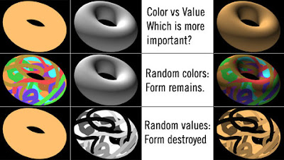 Ref image by Joseph Francis
Let me know what do you guys think?
Does this article explain to you more about colors and values in comparison?
Related Posts:
-Painterly approach in digital painting
New Drawing Video tutorials:
-Transformers 2 Meagan Fox Speedpainting
-Drawing Watchmen Character Silk Spectre
-Learn how to draw Watchmen character: Nite Owl
-Concept art tutorial Hovercraft
-How to draw man's head basic
-Drawing Wolverine basic comics style
-Character Design Face Male Merchant Character
More full length PREMIUM video tutorials

MORE Brushes Download: FREE
- Scales Brush Set for Photoshop
- Fire Brushes for Photoshop and Gimp
- Splatter Brushes for Photoshop
Here is the definition of value from Munsell
Value, or lightness, varies vertically along the color solid, from black (value 0) at the bottom, to white (value 10) at the top. Neutral grays lie along the vertical axis between black and white.
Here's an excerpt from what Craig Mullins (Master Painter) says on the matter of values:
"Decide what is in light and what is in shadow and don’t mix them up. Think like a comic artist. Two values, but if they are well thought out and designed and drawn they can look totally real. Think like that, but instead of making the light white and the shadow black, make the light a 7 and the shadow a 3. Then go ahead and use 5-10 in the light and 1-3 in the shadow to pull out sub forms. DO NOT use 1-5 in any part of the light, or use 5-10 in any areas of the dark. Keep you edges a little softer in the shadows, a little sharper in the light, you are done. (0 is black, 10 is white) Deciding what is in shadow and light for a particular object is pretty hard in words. I will leave that up to you and that is 99 percent of the struggle."
"Hierarchal significance for any color: 1. Value 2. Saturation 3. Hue" -Craig Mullins
Observations, experiments and rants on the production and practice of digital art. The open notebooks of Joseph Francis. Artists struggle over getting correct colors, yet often neglect to get correct values, in spite of the fact that of the two, values are more important than colors at revealing an object's form.
Notice in this image demonstrates if the values are distorted or wrong,
then you cannot even tell what is the picture really is (roll #3 the 2nd pic).
On the other hand, if the value is correct no matter what color you paint in
the shape and readability most likely will maintain ( roll #2, 3rd pic)
 Ref image by Joseph Francis
 Does this article explain to you more about colors and values in comparison?
Related Posts:
-Painterly approach in digital painting
New Drawing Video tutorials:
-Transformers 2 Meagan Fox Speedpainting
-Drawing Watchmen Character Silk Spectre
-Learn how to draw Watchmen character: Nite Owl
-Concept art tutorial Hovercraft
-How to draw man's head basic
-Drawing Wolverine basic comics style
-Character Design Face Male Merchant Character
More full length PREMIUM video tutorials
MORE Brushes Download: FREE
- Scales Brush Set for Photoshop
- Fire Brushes for Photoshop and Gimp
- Splatter Brushes for Photoshop
Comments
the illustration makes it very easy
to understand.
Look at this tut: http://idrawgirls.blogspot.com/2008/10/concept-art-tutorial-painting-landscape.html
Knuckle> I thought so brother, stumble upon that image is money!!!
Thanks to the internet.
Thanks for the share
Just so thrilled I have this resource I thought I better post to get it out of my system.
Thanks!
Oh and PS if I follow your tutorials and come up with a similar image, can I put it on my deviantart (with reference to you) or would you rather me not for copyright sake?
Luca>Thanks
Pokepetter> thanks
Snow> Thank you brother, :) Hey if you did it then it's yours, it's not like you using somebody's image and claim it's yours. You have all the right to post it because you yourself did it. :)
Keep up the good work! I will try to keep posting more tut as soon as I recover. :)
After reading Colors vs Values, I hope to improve the outlook of my works.
Post a Comment